The Sign Says It All: Britain’s Oddest Village Entrance Boards and the Tiny Feuds Behind Them
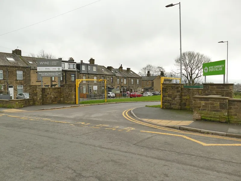
Photo: Stephen Craven , CC BY-SA 2.0, via Wikimedia Commons
You know the moment. You leave a dual carriageway, pass a lay-by, and then it appears: the village sign. Sometimes it is a handsome wooden slab with an oak leaf and a date. Sometimes it is a municipal rectangle informing you that the place has won Best Kept Village three times and is twinned with somewhere in Normandy. And sometimes it is a hand-painted scene involving a sheep, a church and what appears to be a small explosion.
We tend to treat these signs as background furniture. They are not. They are little declarations of identity, stitched together by parish councils, local artists and people who feel strongly about the correct shade of green. In 2026, with so much of British life happening on a screen, the village entrance sign remains gloriously physical: weathered, specific and occasionally passive-aggressive.
The Latin Motto Flex
Nothing says local confidence quite like a Latin motto on a sign that most drivers will pass at 38mph. Some are ancient. Some are the result of a clerk finding a phrase book in 1987 and deciding the village needed a bit of gravitas. Either way, they are magnificent.
A good village sign motto does not need to be accurate so much as sincere. It might promise peace through unity, strength through work, or, in one memorable case, something about bees that nobody has fully translated since the Queen’s Silver Jubilee. Latin gives a place a sense of history, even if the history was assembled by committee on a Tuesday night.
The puns are where it gets really good. Britain loves a Latin joke the way it loves a pub garden with a slightly wobbly table. If a village can work in a wordplay about its name, its river or its most famous vegetable, it will. The rest of us just nod politely and assume it means something profound about community.
Painted Animals and the Village Brand
Then there are the animals. A pig. A swan. A horse. A sheep with an expression that suggests it has seen things. Painted animals are the closest many villages get to having a logo, and the results are often charmingly un-corporate.
The animal on the sign is a serious business. It says: we are rural, we are friendly, we have a pond. It also invites opinions. If the pig is the wrong pink, someone will notice. If the swan looks aggressive, someone will say so. If the horse has been repainted by a well-meaning volunteer with a slightly different sense of proportion, the parish newsletter may need a letters page.
This is folk art with planning permission. It is also a reminder that local pride does not always need a budget. A sign can be carved, painted, repaired and repainted, and each layer adds a bit of story. The best ones look like they have been argued over, which they probably have.
The Passive-Aggressive Additions
Look closer and you will often find a second sign bolted beneath the first. This is where Britain really expresses itself.
‘Please drive slowly through our village.’ ‘No HGVs.’ ‘Thank you for not parking on the verge.’ ‘Dog waste bin — use it.’ ‘Gate must be closed at all times.’ These are not just instructions. They are tiny dramatic monologues about local life. Someone has been annoyed. Someone has called a meeting. Someone has ordered a laminated notice.
The village sign becomes a noticeboard for unresolved grievances. A neatly painted welcome can sit directly above a metal plate warning drivers that the lane is unsuitable for caravans. It is welcoming and firm at the same time, which is a very British combination. The sign says: we are delighted you are here, but please do not ruin it.
The Rivalry Down the Road
And then there is the quiet competition. The neighbouring village has a bigger sign. Or an older one. Or one with a flowerbed. Or one that was featured in a county magazine in 2019 and has not been allowed to forget it.
Village signs are part of the great British tradition of comparing yourself to the place five minutes away and finding it slightly wanting. This is not usually hostile. It is more of a low-level sign envy. Why does their board have a map? Why does ours just say ‘Please slow down’ in a font that looks like a microwave manual?
Parish councils can spend surprising amounts of time on this. There are discussions about materials, wording, whether to include the twinning association, and whether the sign should mention the village hall. The final design is often a compromise, which is another way of saying it is perfect.
Folk Art Worth a Second Look
Next time you pass a village sign, give it a moment. It is not just a name and a speed limit. It is a self-portrait: the animals, the motto, the tidy lettering, the slightly cross note about bins. It tells you what the place thinks it is, and sometimes what it is worried about.
These signs are overlooked, under-photographed and occasionally stolen after a rugby match. But they are part of the odd furniture of British life, and they are worth more than a glance. Just don’t park on the verge while you take the picture.